A new chapter, a new branding!
‘We are entering a new phase with Mentech and that includes a new look. We are a high-tech, innovative and young company and we want to radiate that.’ says CEO Erwin Meinders. That’s why our Marketing Strategist Manouk Hermans started a project together with Jelle Zweegers to design a new logo that fits the new phase of Mentech. The resulting logo fits our core values very well.

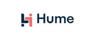
Not only did we give Mentech a new look, we also designed a new logo for the HUME. The HUME stands for humanity, connection and support – but how do you translate that into a logo? Luckily Jelle Zweegers knows the answer to that question! In the HUME logo, the care provider literally stands upside down in order to understand the client’s behavior. In this way, we want to stimulate thinking outside the box in healthcare. In this way, misunderstood behavior is something the caregiver can work with and we offer the tools to make this easier. In terms of colors, we chose to keep the dark blue base color of Mentech to maintain consistency. In addition, we chose a pink color that is central to the warm care that the HUME can complement.